Wilder Things Magazine
In my first semester at the University, my LLC (Living Learning Community) for Creative Writers at the University of Iowa was visited by several on campus literary magazines. Among them were representatives of Wilder Things Magazine, a magazine that focused entirely on publishing speculative fiction. At the end of their presentation, they revealed that they were looking for someone to take over their book design and typesetting.
I had never before considered book design as an option when thinking about the skills I wanted to build at university. However, I decided to take a chance, and later that night, I emailed the Wilder Things team about my interest in learning more about design.
Their current designer was eager to help, and I was thrown in immediately to help them typeset their fourth volume. When I was added to the team, they were already midway through the developmental process, and I had to learn Adobe InDesign quickly to remain on their printing schedule. It was a whirlwind of self-teaching and trial-and-error, but I will never forget the feeling of holding the printed book in my hands at the launch party and flipping through the pages that I had spent so much of my time putting together.
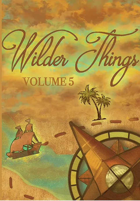
Since my first year, I have designed four covers, and have typeset two print editions of the magazine. For the fifth volume, I collaborated closely with the web design team to create a specially themed issue.
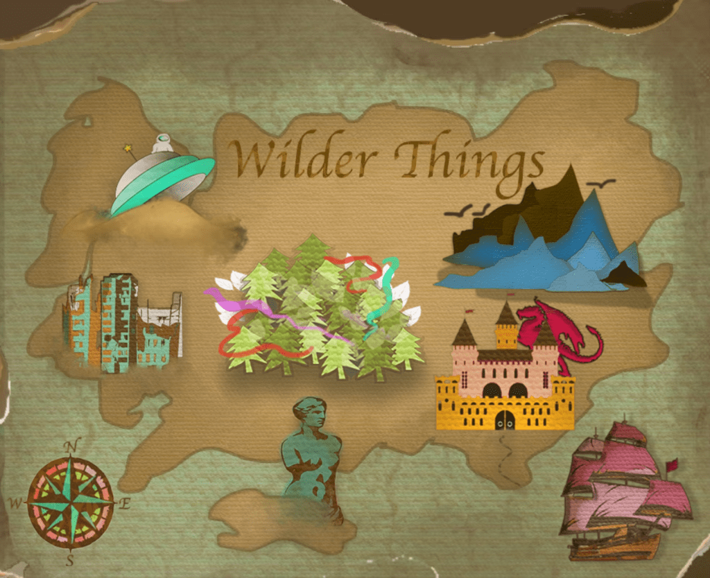
I created a map with photoshop with clickable icons for more interaction and exploration.
Volume 6 was my first printed cover!
The latest cover was inspired by oil spills and how rainbows can be seen hiding within the darkness.
Class Projects
My third semester, I took a class called Book Design for Publishing, where I learned more about InDesign and Photoshop to design my final project: a poetry book entitled The Hunger that I wrote, edited, and designed entirely by myself.
In the class, Elements of Graphic Design, I was assigned to design a book cover. Using Adobe Photoshop and Adobe Illustrator, I developed this cover spread for Jane Austen’s Pride and Prejudice.

My other option was this front cover of Charlotte Brontë’s Jane Eyre.
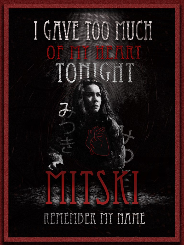
In the same class, I was tasked to create a poster using Adobe Photoshop. I chose to design one for my favorite artist, Mitski, with lyrics from her song “Remember My Name.”
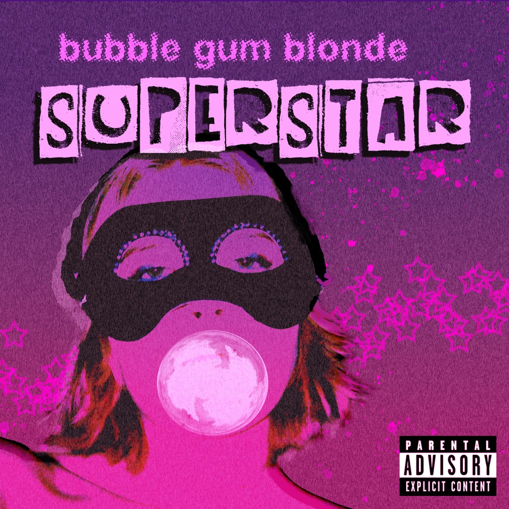
I made a fake album cover for my made-up band “bubble gum blonde” and their album Superstar.
Our final project was to create a brand identity. I made up a publishing company called “frostleaf” using a cool toned color palette.
In my Publishing II: Advanced Literary Publishing class, I worked on the design team to create an entirely new template for our collaborative field guide, where four different sections of the same class worked separately to develop their own 50 pages of creative writing about different types of art in Iowa City. Our section, titled “Iowa City Beats” focused on music. With my experience as a designer, I led a team of 4 individuals with varying skill levels and InDesign experience to typeset our section of the magazine into cohesive spreads, while keeping in mind the limitations of our class budget and the capabilities we had as artists and designers. As a team, we decided on our aesthetic vision and ran with it. I also worked hard to provide all the graphics within our section of the magazine.
